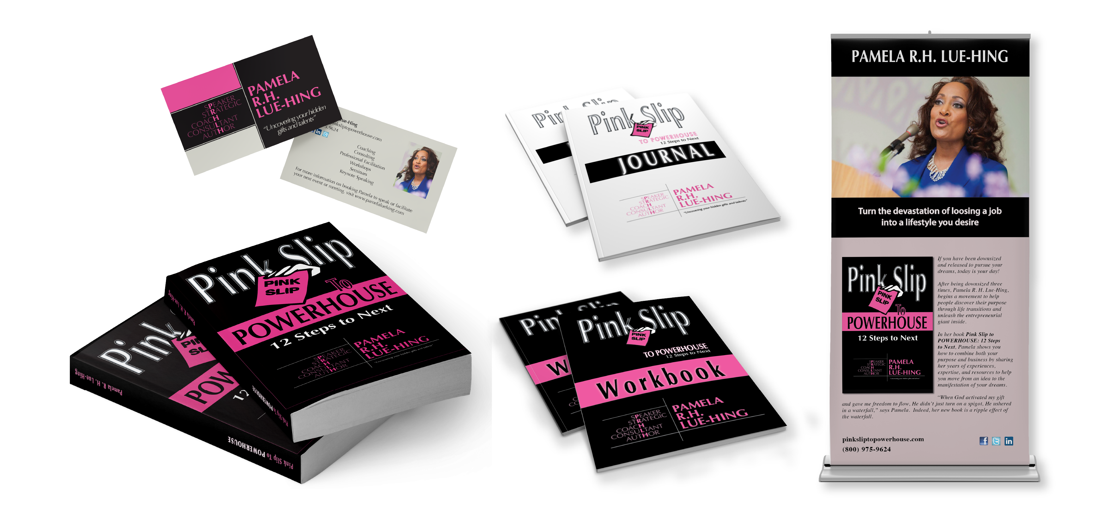

Pink Slip to Powerhouse began as a book cover redesign and expanded into a branding project for its launch. The color pink was incorporated to represent the femininity of the author, as well as the book title, yet not be an overwhelming focal point. I wanted to make a powerful statement visually that appealed to both men and women; therefore, black was incorporated to give it an authoritative balance in contrast to the pink. The typography for Pink Slip is stylized in a way to gain the attention, yet soft enough not to deter. As an added twist and contradiction, I purposely designed the word "pink" in white. I felt that Optima’s full-bodied capitals was an excellent typographic choice, that would help visually define the dynamism of the term powerhouse.